Never attribute to malice what can be explained by incompetence
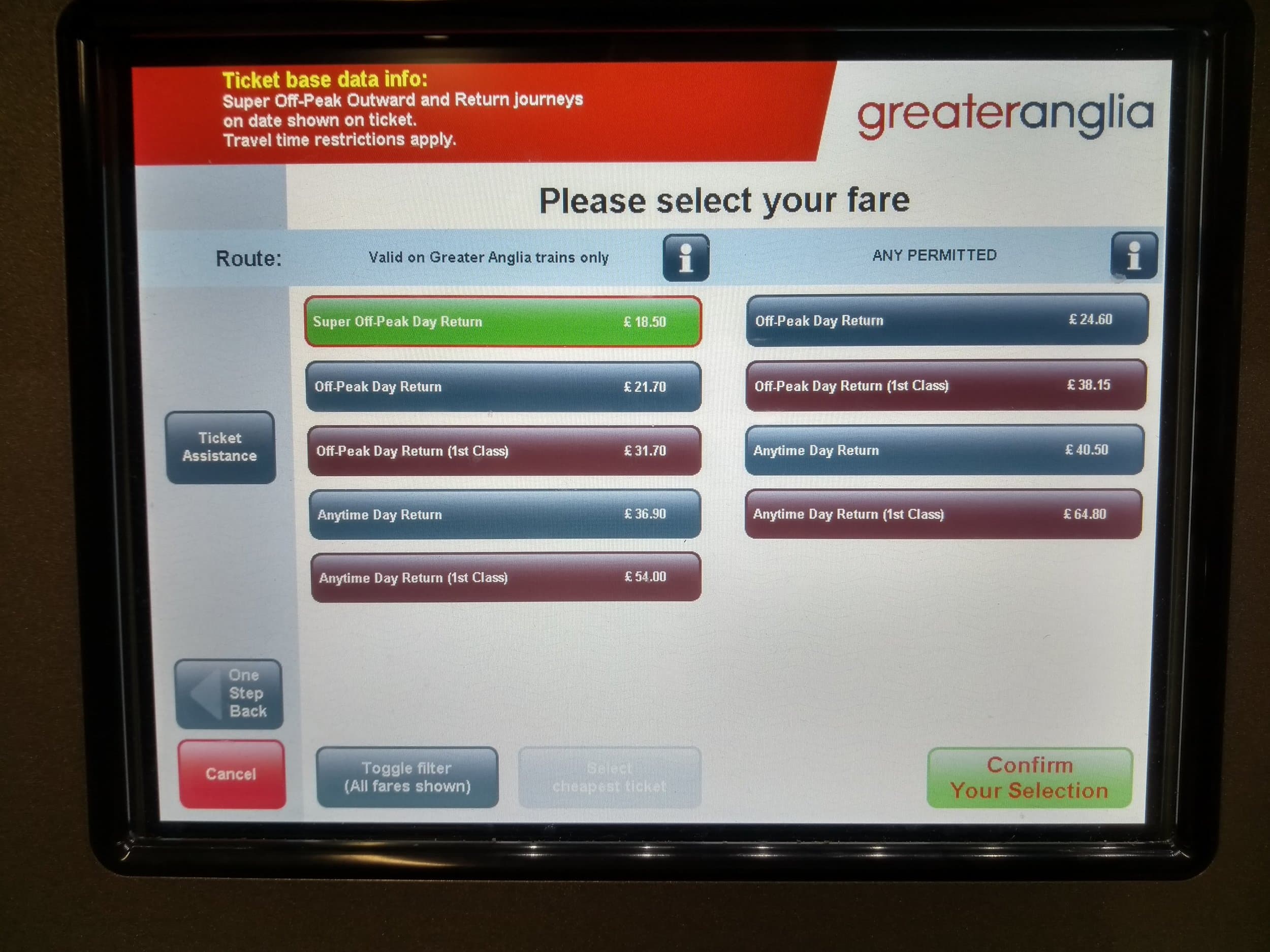
I remind myself of this saying whenever I come across a new and surprising example of poor user interface design. With this is mind I'd like you to consider this ticket machine at Cambridge North station.

You reach this screen by choosing to travel to London. For those of you who make this journey regularly, you'll know that there are two routes into London from Cambridge. One ending up at Kings Cross. The other at Liverpool Street.
Since Cambridge North station opened I've travelled from there to London around twenty times. I've also bought the wrong ticket on two occasions. The first time I put it down to careless on my part. The second time I realised it wasn't me but the ticket machine. As I was buying a second ticket from the ticket inspector on board the train I asked him if this was a common occurrence. It turns out it is. It keeps happening. Why?
Let's look at the offending screen again.

The problem occurs if you want to travel to Kings Cross. Which button do you select? First up you've got to decide which of Super Off-Peak, Off-Peak or Anytime applies to your journey. Also, you're left wondering why the prominent green Super-Off Peak option only exists on the left-hand side. You then are probably asking yourself why there are two columns at all.
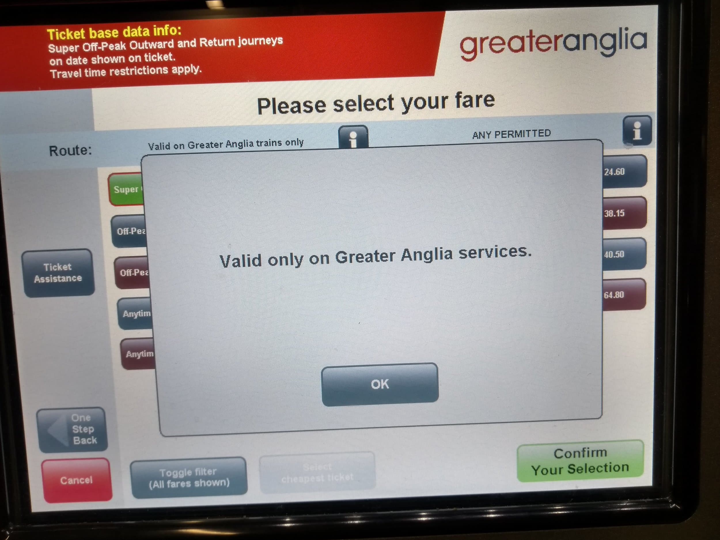
Hmmmm. "Valid on Greater Anglia trains only" is written above the left column. But what does that mean? I want to get to London. I do not want to learn about the different train operators. There's an information button next to it. Perhaps that will help?

Oh. Thanks.
This is all assuming you have had your coffee, or are awake enough, such that you haven't just mashed the first likely looking option that appears in front of you!
What's going on here? How did we end up with this mockery of good user experience? We'll probably never know. However, I have worked in the software industry on and off for over a decade. I have a lot of empathy for the challenges the developers, designers and managers face when putting together something as complex as the ticketing system for a whole country. My experience is that we end up with poor designs such as this when the organisation as a whole does not value user experience. And, particularly, does not value thinking about solving problems from the users' perspective.
The biggest tell for me is the way the train operator's name is displayed to the user. It's a classic example of technical jargon leaking out of a system. It is technically correct.
But it is also actively harming the chances of someone buying the correct ticket.
We can do better. I'm a fan of some of the ideas contained in the theory of Jobs to be Done, but you don't need a fancy framework to do better. As an industry, we need to value our users and customers more. Customers are people too.
