World marathon courses infographic
Every now and then I like to put together an infographic poster as quickly as I can. My latest attempt is this poster of World Marathon Courses.
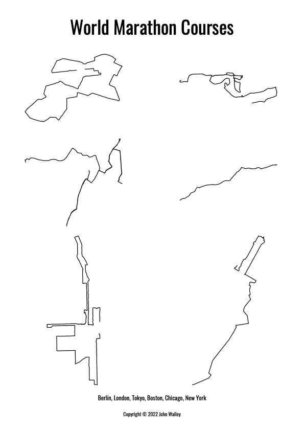
It is inspired by Neil Freeman’s Subway systems at the same scale poster; which shows 140 of the world’s metro systems side-by-side.

Let me walk you through the process of putting it together and describe some of the decisions I had to make along the way.
Getting hold of the data
A important task once you’ve decided on the subject is to get hold of the appropriate data. Sometimes this might simply be a list of numbers, e.g. World’s tallest mountains, or World’s longest rivers. Even then, it is important that the numbers are trustworthy and you provide your source.
For geographic projects things are usually much more involved. To begin with I checked to see whether the marathon events themselves provided any suitable course data. This was always going to be a long shot and indeed nothing turned up.
Then I had a brainwave: fitness tracker data! Millions of people upload their runs to sites such as Strava. All I have to do is download the publicly available GPS data for a marathon run on each course. A little clicking around leaves us with a collection of GPX files.
Data transformation
Ultimately, we need to draw the GPS data to a 2D poster. How can we convert the latitude and longitude GPS data to x and y coordinates?
Partly, this choice is constrained by the language and environment we’re working with. I went for Javascript. Not for any reason other than that’s what I’d been working with the week beforehand.
The combination of Mapbox’s toGeoJSON and d3-geo does the job nicely.
Pulling it all together
I wanted the final output to be a pdf (with an image as an alternative output). Now, if I were putting together the poster manually I would reach for an application such as Adobe Illustrator and I could choose to export as a pdf, or anything other format I wanted. Here, I’ve opted to generate everything programatically. I’ll come back to the pros and cons of this approach but for now we need a Javascript tool or library which can produce a pdf document.
I selected React-pdf. Again, I chose it for pragmatic reasons. This time it was mainly because it’s something I’ve been considering for an unrelated client project and this gives me an excuse to try it out.
And what a pleasant experience I had with it. Excellent documentation and does just what I want.
Challenge #1 - Scale
An important feature of the Subway systems of the world poster mentioned at the top is that all the systems use the same scale. This is something I wanted to keep for the marathon courses. The problem for my poster is that the courses are very different shapes and there are only six of them. If I want to lay them out in a grid (2x3) it ends up looking odd.
The issue is best visualised by starting with the Boston marathon course. It basically runs from west to east, which means it is wide (horizontally) but short (vertically). If I were to use the same scale for each course then every other course would be very thin (horizontally). In particular, Chicago and New York, already quite thin (horizontally) courses, would get squeezed even more.
In the end, mainly driven by time and producing the poster programatically, I opted to use a different scale for each course. With more time and a manual layout, I suspect there is a visually appealing layout that allows us to keep the common scale.
Challenge #2 - Manual vs programmatic
I’ll be honest. I’m better at writing code than I am at using a tool like Adobe Illustrator. While it might sound perverse I can more reliably and quickly put together code to generate a poster than I can put one together by hand.
That said, for visualisations which are heavily data-driven and where the data may change, or you want to play around with how the data is interpreted, you’ll need to reach for code anyway.
Where the code-first approach becomes especially tedious is for tasks like laying out text for a title, or making tweaks to the layout of elements to produce a more pleasing result. Here the feedback loop can be frustrating. Imagine positioning the title text:
- Pick a number for the vertical position of the title
- Run the code
- View the result
- It’s not quite right so try another number
In conclusion
All in all a fun exercise. My favourite part was realising I could get the maps of the course from publicly available gps data provided by runners.